Anatomy of a card

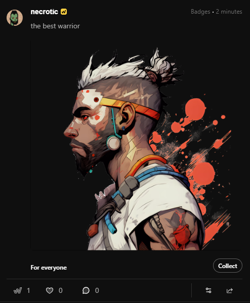
Agent N
Last Update 3 bulan yang lalu
Whether viewing in the Feed or in an isolated stand-alone view, the card format puts the focus on the content but also provides related metrics and calls-to-action to interact with each post. These sit along the bottom of the card, showing data and links for Events, Likes, and Comments to the left, and Sharing, Post Settings, and Web3 settings to the right.
Card Header
The header is where key information about the post is presented, such as creator name and profile image, post type, and the post age timestamp. Clicking the name of the creator will link to their profile, clicking the post type label will filter the Feed by content of that type, and clicking the timestamp will link to an isolated view of the post.
There is also an eyebrow label that will appear above the header if the post was surfaced algorithmically by the Feed, for example to display a post that was interacted with by another user that you follow. This eyebrow will appear like "UserXYZ joined", such as in the case of a Chat room.
Card Body
This main section of the card is where the post content is displayed. The post description will appear first, followed by the Badge image or Chat, Content, or Points preview card. Then at the bottom will be an indicator for any active Integration or eligibility criteria (e.g., "Discord Server Member"), with an accompanying quick action button for "Claim", "Join", "Unlock", etc.
Card Footer
This is where all of the metrics and post interactions are displayed with the following actionability:
Events
Events are represented by the "W" icon and give insight into all historical deployments of that post. Clicking this will show a modal with a list of all active and past Events. If you are the content creator, there will be actions available in this menu to manage them--such as End for an active Event--but if you are not the creator, you will instead be presented with the Claim or Unlock actions, dependent upon the requirements set for that post. In addition, post creators can click a specific Event in the list to set it as the default claim condition on the post card.
Likes
Beside the Events metric is a heart, which represents the brand new Like functionality. You can now Like any post on the site, which gives it weight and reach and helps to fine-tune how that content is handled by the algorithm. Clicking the Like count will open a modal window with a list of everyone who has Liked the post.
Comments
Last in the left-hand items is Comments, which opens a modal with a form allowing the user to leave a comment on the post for all to see. The full list of comments left can be viewed on the isolated view of that individual post.
Sharing
On the right-hand side of this bottom-most bar, the Sharing icon opens a dropdown with a list of ways to share the post, such as copying the URL to the clipboard or posting to other popular social networks. For users with a connected Web3 Wallet, an additional option that becomes available is "Pin to qNFT", which allows a Badge to be linked to an eligible qNFT (Quantum NFT) that the user possesses (if any).
Settings
The Post Settings icon only appears for the creator of the post and opens a dropdown with options for modifying it, such as Edit Post, Edit Privacy, and Delete Post.
Web3
This is an advanced setting available to users with a supported Web3 Wallet connected to their account, giving an extra layer of on-chain interactivity. With this option any Badge can be minted as an NFT on the Ethereum blockchain or any supported Layer 2 (Polygon, Optimism, Avalanche, Arbitrum).